Doodle Tip: Draw from Real Life

We all use reference when we draw; sometimes it’s from an image from a book or a photo we took. But the best reference  — whenever possible — is to draw from real life.

Doodle Tip: Draw from Real Life


We were especially lucky to live in Brisbane, Australia, where the climate was mostly warm year-round — a great place for doodling outdoors. It’s also fantastic for bird watching. Not only do you see (several kinds of ) pigeons roaming the neighborhood, but there are cockatoos, rainbow lorikeets, and kookaburras. Birds are terrific drawing subjects; we enjoyed taking the ferry to Ascot, a suburb near the Brisbane River, or venturing to the Wynnum waterfront to draw pelicans and seagulls.

kcd_draw_pelican4

Pelicans are much larger than you’d expect, and their distinctive long beaks make them easy to draw, because it’s a very recognizable feature.

  1. Start with oval shapes for the head and body.
  2. Then draw the long, pointy beak, skinny legs, and feathered wings.

See more drawing tips for drawing birds here.

kcd_draw_pelican

Little Dude had his own interpretation of the pelicans. He drew their soft throat pouches, webbed feet and textured wings.

kcd_draw_pelican3 kcd_draw_pelican2


Seagulls are easy to spot anytime you’re near the sea. You have to be quick to capture them, but if you’re patient, you might catch one standing around. Here’s a video of me drawing the seagulls:


One floating in the bay by Little Dude:

kcd_draw_pelican1

trythisGo outside in your backyard, or to the nearby park and see if there are pigeons, crows, or squirrels to draw. Often there may be people walking their dogs, and they make terrific models too. Hope this inspires you to draw from your life too!

Follow my blog with Bloglovin


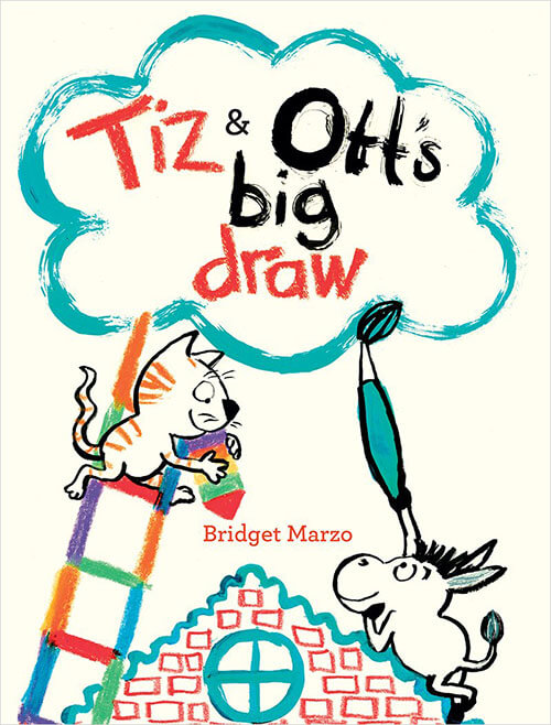
How to Draw Tiz & Ott by Bridget Marzo

tiz and otts big draw

tiz and ott how to


How to Draw Tiz and Ott by Bridget Marzo


Bridget Marzo is the author of Tiz and Ott’s Big Draw published by Tate Publishing. We were lucky to have Bridget as our first guest for Drawn Out, our illustrated interview. Below, Bridget shares how to draw her two clever and creative characters, Tiz the cat and Ott the donkey, from the book:

How to draw Tiz the cat and Ott the donkey from Tiz and Ott’s Big Draw by Bridget Marzo from Bridget Marzo on Vimeo
Video courtesy of the author Bridget Marzo


Follow my blog with Bloglovin


Awesome Artists : Tim Miller

awesome

In this series, Awesome Artists, we talk to our favorite artists to find out their techniques, learn how they do things, and get their tips for creating. We spoke to Kirsten Ulve to get pointers on sketching people, and Allison Langton, who shared her process on painting plants in watercolor. Today we get a behind-the-scenes look at creating a picture book as we chat to Tim Miller, who brought Snappsy the Alligator (words by Julie Falatko) to life (even though he didn’t ask to be!)

Meet Awesome Artist Tim Miller

Snappsy-Covers

Above (from left to right) are Tim Miller’s sketch, color study, and final cover art with typesetting.

It’s such a treat to see these process images, because we usually only see the final art and it’s so easy to focus on how ‘perfect’ they are. It’s important to know that there are many steps to get to the final art. Nearly all professional artists begin with sketches, the rough ideas that we all make — the ‘doodles.’ I want to demystify the process of making beautiful pictures, but I also want to show how much time and love actually goes into creating these wonderful illustrated books.

KCD: Hi Tim. Thanks for stopping by and sharing your work with us! Can you tell us how do ideas come to you?

TM: The inspiration for my work simply comes from a very mundane knee-jerk response to some sort of external stimulus in the world that strikes a chord with me. (For example, the first time I encountered Julie Falatko’s Snappsy the Alligator, mental images came to mind as I read the story — and those mental pictures became the foundation to build upon.) When I begin to sketch an idea, I try to draw what I’m seeing in my mind as best I can, but it’s not always clear. Usually, it becomes clearer only after I make several rough sketches. I continue to refine the concept until I land on something that feels solid.

I think of the process as trying to make out something in the fog. It’s difficult when you’re far away, but as you draw nearer, the details become more distinguishable. A key part of the process, though, is that I have to be entertained. There has to be a good personal motivation in it to lure me forward.

Tim Miller shows How To Doodle Snappsy in this video:

Snappsy Did Not Ask to Be in This Video About How to Draw Him from Tim Miller on Vimeo.


smileNote that Tim sketches with a brush. There’s a loose, fluid quality to the doodle that the ink and brush gives, with variation in the line width and opacity.

trythisHow many shapes does he use? Try drawing Snappsy as Tim demonstrates with a brush, then create your own character with only one or two shapes, such as ovals/circles or squares/rectangles.

KCD: Can you show us your process for creating the art for the book?

TM: One of my favorite scenes to draw in Julie Falatko‘s Snappsy the Alligator (Did Not Ask to Be in This Book) is when Snappsy throws a party. I drew my first sketch directly on the manuscript to make note of the first idea that came to mind when I read it.

party text

Next, I used that rough thumbnail as a starting point to fill out the scene a little more, giving a better sense of space & atmosphere.

party sketch

Then, I began to tighten up the drawing to see things more clearly making some edits here and there to tweak the overall composition.

Party1

I went back at it again with minor adjustments after sharing my roughs with my Art Director Denise Cronin and Editor Joanna Cardenas. The donkey by the door was reading too much like Snappsy (which I knew they were going to say but I really like drawing him), so they asked me to turn it into a different character which is how the weird dog poodle thing came to be. I was also still working out the final look for Snappsy so you can see him changing here too.

party sketch revise

Then it came time to figure out the colors, so I did a rough color sketch. It took me awhile to figure out what color would be good for the interior of Snappsy’s house. I needed something that complimented his green without overpowering him.  From there, I tried to settle on a festive palette of party hats, balloons, and streamers that popped but also balanced with rest.

Party2

For the finish, first I redrew everything in separate peieces with brush and ink and added watercolor to the drawings. Then, I scanned everything in and pieced it together on the computer adjusting all the colors digitally.

party background

part color with furniture

party color

And finally two minutes before everything needed to go to the printer, things landed here:

Party3

smileSee how important it is to work out details in your drawing in a loose sketch first? There’s quite a few drafts before getting to the final art.

Below watch the book trailer that Snappsy did NOT ask to be in:

“Nope,” says Snappsy.

Snappsy the Alligator (Did Not Ask to Be in This Book) words by Julie Falatko, pictures by Tim Miller, published by Penguin Random House.

***

Tim Miller is an author and illustrator based in New York City. His own Moo Moo in a Tutu, published by Balzer & Bray debuts in early 2017.

trythisCompose your next work of art by planning it out first. Sketch a few different ideas, or perspectives/viewpoints of the subject. Before adding color, consider your palette, play with different combinations, and decide your final medium: colored pencils, watercolors or perhaps acrylic paint. You may not do this with every drawing, but when you’re working on something you want to keep, the early prep will help make the final color work much more enjoyable.

All images courtesy of Tim Miller.


Follow my blog with Bloglovin


Experimental Media : markers

marker_exp_media

Experimental Media


Drawing with markers

Did I tell you we just recently moved all the way from Australia to England? Which means that at the moment our drawing implements are pretty basic since we haven’t received our shipping container yet. But last week, my sister-in-law gifted me a collection of markers. They naturally became my second media experiment.

Markers and pens have never been my favorite drawing tools because I find that the consistent line width means they are are less forgiving; that any mistakes are easily seen, and you can’t erase them! You either have to be pretty confident with the marks you make, or not worry too much if they aren’t exactly perfect. The beauty of this experiment is that I’m trying new things and learning how to use them.

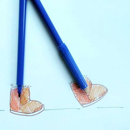
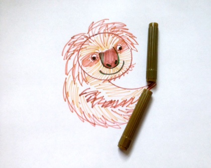
I first tried incorporating the markers in my doodles.

fox_marker

uggs_marker

sloth_marker


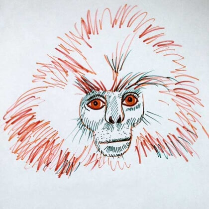
Then I just doodled with them, trying monkeys for upcoming Lunar New Year:

gee_golden_langur


What I learned

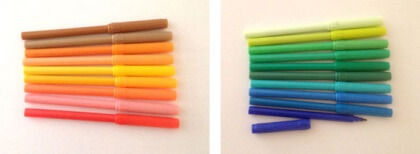
Since you can’t really blend with markers,  the best way to shade is by using different colors. I grouped similar colors together, limiting my palette with each drawing, using the light colors as highlights and darker hues for the shadows.

marker_sets

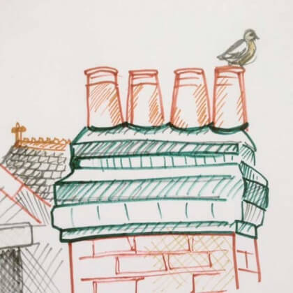
And while the line widths are uniform, you can be expressive with the strokes, as I tried to be with the animal fur, and in the hash marks for shading too.

chimney_marker

The one bummer is that when the markers have been used awhile or if you forget to put the lid on, they do dry out, and may affect the quality of your drawing.

trythisHave you tried using markers? I bet you have some lying around the house. Give them a go! The more you use them, the less likely you are to be concerned with mistakes, because you can’t erase! It’s actually freeing!


Follow my blog with Bloglovin

Awesome Artists: Allison Langton

awesome

In this series, Awesome Artists, we talk to our favorite artists to find out their techniques, learn how they do things, and get their tips for creating. We spoke to Kirsten Ulve, when we were drawing selfies, to get pointers on sketching people. Now that we’re focusing on nature, I’ve asked Allison Langton, an illustrator who’s a master with watercolor and drawing plants and flowers, to share her tricks for mixing colors and working with this wet medium.

I had the pleasure of working with Allison when we worked on the design/illustration of a gardening book called Grow a Little Fruit Tree by Ann Ralph for Storey Publishing. She is as nice as she is talented — thanks for sharing your work with us Allison!

Meet Awesome Artist Allison Langton

05-photoshop-bearded-iris-allison-langton

Above is a bearded iris illustration that Allison did for Australian House & Garden magazine. Below she gives us a peek into her process.

KCD: Watercolor is a medium that is easy to learn, yet hard to master. It’s quick drying, yet takes time to fine-tune the painting. What makes watercolor ideal for illustrating nature?

AL: I think the translucency and blending qualities of watercolor make it the perfect medium for illustrating nature. The ability to build up color over multiple layers or bleed colors together to create new and unexpected combinations is ideal for capturing the constantly moving, changing and growing characteristics of nature.

01-drawing-finding-the-line

smileAs you can see here, Allison is sketching irises and exploring ways to capture this flower. It’s important to sketch and work out things such as how many flowers to show, angles, perspective, composition, before going to a final drawing. It’s good to realize that not every drawing is a “masterpiece,” and that sometimes it’s ok to try it several times.

KCD: I find that when I draw nature, I get overwhelmed by the details. For instance, a tree is made up of many leaves, and I find myself defining each one. How do you figure out what details to leave out and what is necessary to give your work realism?

AL: I struggle with this! It’s such a big challenge for artists but I think it becomes easier with practice.

The great thing about watercolor is that you start painting light to dark, so you can lay down a light wash or suggestion of trees and branches then go back in with some leaf detail but only where you want the eye to focus — much like in landscape painting where the foreground is usually much more detailed than the background to draw the viewers eye into the landscape.

02-pencil-drawing

smileSee how Allison starts the drawing with a light pencil sketch that she uses as a guide for her painting?

KCD: The other thing I find hard to do is mixing the colors, so I don’t end up with one big green blob for trees, leaves, and grass. Or blending a blue color for sky that doesn’t seem like you just squeezed it out of the tube. Do you have a trick for this? How do you vary the palette to keep it true, and interesting?

AL: Mixing colors takes time to master. I’m still learning. Nature is full of different greens. Yellow greens, blue greens, dark olive greens, silvery grey greens. You can create a whole palette of greens by mixing your tube green with a little yellow to get a lime green or a little blue for a teal green or even with some red for a darker olive green.

A good mixing tip so colors don’t look like they’ve come straight from the tube is to ‘dirty them’ by adding a little bit of color from the opposite side of the color wheel. For greens, this means adding a little red. Just a little. I will add a little crimson to some hookers green or sap green to create more of a realistic olive green when I’m painting leaves. For blue, this means adding just a touch of orange, for yellows add a touch of violet.

trythisOften when trying to make colors darker, we add black to it, but have you noticed that this also makes the color “dead,” or less vibrant? Try adding a complementary color instead (the color opposite on the color wheel), a technique that Allison refers to above as making it “dirty.”

Sometimes your painting will be more harmonious if you limit your color palette. A great example of this would be the artist Anders Zorn (1860-1920) a Swedish painter, who was famous for using only ochre (yellow), vermilion (red), white and black in his paintings. He used oil paints but the color theory is still the same. This video is a great example of just how many colors you can get by mixing two colors plus white and black.


“Amazing!”


Always practice mixing your own colors, it’s such a handy skill. And you won’t have to buy as many tubes!

03-watercolour-leaves-stems-first-wash

smileAllison has her reference photos close by as she’s working on her final draft of the drawing.

KCD: What do you find most challenging about drawing nature?

AL: Capturing the spontaneity of nature is tough. I tend to be very tight and controlled when painting which can often lead to an overworked lifeless illustration. I have to remember to loosen up a bit, work more on blending colors on the paper rather than my palette. It’s a constant work in progress…

04-watercolour-flower-washes

***

Allison works under the name Big Print Little in Melbourne, Australia. Thanks for sharing your work with us Allison!

trythisHave you tried watercolors or watercolor pencils? They’re fun to experiment with. You can add color to drawings very quickly by doing big washes of color; the water flows and is not easily controlled, but it gives a lovely variation to the color. With the pencils, you can draw first and then add water to change the drawing into a painting, making it a bit less mess.
What do you like about watercolors?


All images courtesy of Allison Langton.


Follow my blog with Bloglovin

Awesome Artists: Kirsten Ulve

awesome
Today we’re debuting a new feature called Awesome Artists. In this column, we aim to examine artists’ works and see if we can learn from their techniques, process, or expertise.

Meet Awesome Artist Kirsten Ulve


kirstenulve1

It’s such a pleasure to start this terrific series with someone whose work I’ve always admired: Kirsten Ulve. A renowned illustrator who specializes in creating caricatures, Kirsten works in a digital medium using Adobe Illustrator and Photoshop. Her stylized work has appeared in countless publications including The New Yorker, Glamour, Entertainment Weekly, and InStyle.

kirstenulve2

I marvel at her ability to capture the essence of someone in her unique voice — and she was gracious to grant us an interview! Kirsten not only shares her creative process, but her pencil sketches (which she would propose to a client before doing a final colored rendition) too.

smile
See if you can guess who is depicted in the drawings!

oprah sketch

KCD: Do you try a few different sketches, trying to see how much you can stylize someone?

KU: No, I  just start sketching and see where it goes. For me, there is usually only one answer when doing caricature: it either looks like the person, or it doesn’t! Sometimes I simplify the drawing when it goes to color.

thoughtHer stylized approach reminds me of Cubism. The way the physical features seem to “sit” on different planes, as if there are multiple viewpoints instead of one perspective is common in Cubist paintings. The sharp angles with contrasting curvy swirls mimic the fragmented look seen in works by “Les Demoiselles D’Avignon” (1907) by Pablo Picasso or “Woman with a Mandolin” (1910) by Georges Braque.

Oprah


What do you look for when you draw someone?

I always start with the eyes and try to capture the feeling there, or the personality the person usually shows to the public (or portrays in a movie if the caricature is about that). It helps to look at video of the person speaking so I can see how their mouth moves, or how much their teeth show when they’re speaking, or how far their nose sticks out. A lot of pictures are taken head on, so it’s hard to see how big noses are. Then I look at the distances between features on the face.

question
There’s a geometric quality to her characters. Can you see circular or triangular shapes or parallelograms in her drawings?

Amy Poehler sketch Amy Poehler

Who/what types of faces(?) was/are the hardest person to draw? And why?

I can never predict who’s going to be hard or easy to draw. It just depends on what mood I’m in. I can’t do it if I’m tired or angry. It’s like I just start drawing and they just eventually appear. But in the past, the people that took me forever to get right were Sara Jessica Parker and Bradley Cooper! I think the reason is because I was focusing too much on one feature instead of capturing the whole face, which I always try to do.

Shaqsketch
Shaq

smile
Don’t you love that she’s audacious enough to color someone purple?

For most people, drawing a face is the most difficult; it’s hard to capture the likeness well. It seems amazing to me that you so confidently capture their likeness, while infusing your own voice. Is there any insight you can impart to all of us who are learning to do that?

For me, it makes it so much easier to draw someone if you’re familiar with the way they act (this is why I like to use video). Also, it really helps if you can try to “be” that person a little bit while you’re drawing. Go ahead and try to imitate them! It helps me get their expressions right. I try not to work from one photo. It’s good to have a variety of pics at different angles with different expressions. This way you can get a feeling of how someone moves their face. It’s hard to work from normal, smiling photos. A person’s unique look comes out more when you can see them being themselves.

***

It’s interesting to learn that Kirsten prefers to use videos for drawing reference instead of photographs. Whenever possible, it’s better to draw things that we can see three-dimensionally, rather than a 2D image. I think it often feels more lively when we do. Sometimes a photograph can distort information we see, depending on light and perspective, and be misleading when we try to copy it. (Not a perfect example, but remember that viral blue and gold dress?)

trythis

Let’s conduct an experiment! Ask a sibling or friend to let you draw them for 10 minutes. Then take a photo of them in a similar pose, and use that image as reference to draw them. Do you notice a difference? Is there an improvement in your drawing or does one portrait feel more authentic than the other?

Thanks again for sharing your work with us Kirsten! See more of her fabulous work here or purchase her art here.

All images courtesy of Kirsten Ulve.


Follow my blog with Bloglovin

Chuck Jones draws Bugs Bunny

Above is Mr Jones drawing one of his most enduringly popular characters. This clip is from the 1991 documentary Chuck Amuck: The Movie.
 
In the video, “Chuck Jones: Extremes and in Betweens – A Life in Animation” (2000), a televised biography that was part of PBS’ “Great Performances” series, Mr Jones credits his parents as the reason he became an artist/animator. He explains that his “mother believed that children could do no wrong, and never criticized [their] drawings.” His father, who moved from job to job, accumulated mass quantities of stationery and pencils from each job and asked his kids to use them up. As a result, Mr Jones drew quite a bit. Later his father enrolled him in the Chouinard Art Institute (now California Institute of the Arts).


Screenshot 2015-03-31 21.15.44

My name is Wile E. Coyote — Genius
Original watercolor on Arches paper, 14″ x 11″, by Chuck Jones circa 1995.


When I was seven, I made my grandma wake me up at 5:30 am every morning so I could watch “The Bugs Bunny & Road Runner Show.” It was my favorite show. With Easter in mind, we’re honoring our favorite “wascally wabbit.” We selected a few favorite stills and sketches from Bugs’ creator/director’s official Tumblr of Chuck Jones.

Bugs was so shrewd, always outsmarting Elmer Fudd.

Screenshot 2015-03-31 21.13.37

“A Wild Hare” directed by Tex Avery and released in theaters on July 27, 1940.
Image courtesy GoldenAgeCartoons.com


We agree: he’s super!

Screenshot 2015-03-31 21.12.23

“Super Rabbit,” directed by Chuck Jones and released in 1943. Top, original lobby cards;
center, original layout drawing by Chuck Jones, graphite on 12 field animation paper.


Screenshot 2015-03-31 21.10.58

Design for a cut-out sign of Bugs Bunny for the front gate of Warner Bros. Studios by Chuck Jones, circa late-1940s. Graphite and colored pencil on 12 field animation paper.


via The Kids Should See This and Kotte


Follow my blog with Bloglovin


Doodle Tips : Draw at an Angle

Doodle Tips

Want a simple way to improve your drawings? Try this doodle tip:
face-8

Next time you’re drawing, instead of having your paper or pad flat on the table or floor, try placing your sketchbook (or paper on a clipboard) at a 45-degree angle, or more vertical than horizontal. You’ve probably noticed artists drawing at an easel, right?

When you have your paper at an angle, it will make it easier to translate what you see onto the paper, with less distortion. So, try propping your pad upright, against a table, your knees, or using an easel, as shown above and below.

face-6

I dare say you’ll see a huge improvement in the accuracy of your drawings! Check out more doodle tips here. Happy doodling!

Follow my blog with Bloglovin

How to Draw Your Face

Here’s a step-by-step tutorial with tips for drawing your face. Before you begin, you will need:

face_pad

  1. A mirror or photograph of yourself
  2. Drawing paper or pad
  3. Pencil or pen
  4. Optional: eraser or sharpener, and an easel or clipboard

A. Observation

Start by looking at your face (in the mirror or at a photo of yourself) and studying your features.

face_face

  1. Face shape. What’s the shape of your face?
  2. What’s the color of your eyes and hair?
  3. Do you have any distinguishing characteristics? For example, freckles, moles, glasses, or birthmarks can set you apart from others.

B. Foundation

Sketch the structure of your face:

face

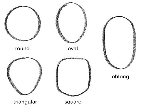
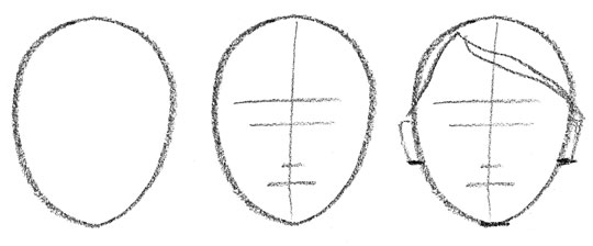
  1. Draw the face shape (round, square, triangular, oblong, or oval—the most common)
  2. Divide the face in half with a light line to help a guide the placement of the features.
  3. Add a light line as a guide for the eyebrows.
  4. Continue with guidelines for the eyes, the bottom of your nose, mouth (line between upper and lower lip), chin, and (bottom of the) ears. TIP: Notice that the line for your eyes is approximately halfway between the top and bottom of the face (lower on toddlers and babies), while your ears line up with your eyes and the bottom of your nose.
  5. Lightly sketch the hairline.

C. Features

Draw in the features:

face_brows

  1. Eyebrows – When you shape the eyebrows, try drawing in the direction that the hair seems to grow. For instance, start near the middle of the face, near the bottom of the brow and moving the stroke upwards and out, and repeating with the rest of the brow as you shape it. Sometimes for men with bushier brows, you’ll want to do the opposite, starting near the outside, at the top of the brow and coming downward with your stroke. TIP: Drawing them this way will make them look more realistic and natural. As you draw the brow, take note of how far they are from the sides of the face, and how much space is between them. Try and capture the expressiveness of the eyebrows because they give character to the face.face_eyes3
  2. Eyes – Look at your eyes, and study their shape. Start by outlining the top and bottom of the eyes, then draw in the pupil and iris, leaving a bit out of the black dot for the highlight of the iris. TIP: Leaving the white for the highlight will make the eyes look more alive. Note that you may not be drawing an exact circle for the pupil, and sometimes you can make the pupil slightly larger than they appear in the photo—you don’t want the whites of the eyes to dominate the space. For most people, the space between the eyes is about the width of one eye. Next, indicate the tear duct and eyelid fold. face_nose2
  3. Nose – With the nose, sometimes just having a couple of dots for the nostrils is enough, especially if you want a dainty look, for a delicate face. You can add detail with a suggestion for the curves around the bottom, or shade a bit to shape the bridge or tip of the nose. And sometimes, for strong noses, or 3/4 and profiles, I may add a line from the inside of a brow, stretching to the tip of the nose, indicating the bridge. TIP: With this line, it’s important to only do ONE SIDE. You can shade the other side of the bridge, but having two lines for the bridge of the nose looks cartoony. face_mouth2
  4. Mouth – Most of the time, you don’t actually need to draw the entire mouth—just having a line between the top and lower lip, and an indication of the edge of the lower lip with a line or shading is sufficient. Sometimes for women, I draw the upper lip, shading with strokes to emulate the texture of the lips. TIP: For men, it’s more masculine NOT to draw the entire lips, but just indicate them with a few lines as shown above on the lower right. AND NEVER draw details for teeth. It NEVER looks right, and isn’t flattering in a drawing. As always, double-check the distance between each feature as they relate to each other.face_chinears2
  5. Chin and Ears – Strengthen the original lines you had for the chin and ears, and give them more detail and shape. Notice how much (less) space there is for the chin compared to the forehead. TIP: For men, squaring the jawline makes them appear more masculine.face_hair2
  6. Hair – With hair, I try to draw the strokes to imitate the shape and flow of the hair. TIP: Notice where the shadows are, and make that part darker by drawing more hair detail, and conversely leave out detail in the highlights. This will make the hair look more realistic and natural.

Finally, take a step back and review your drawing. Do you need to add more shading anywhere? Do any lines need refining around the face? Do you need to add any details or adjust the spacing of any lines?

I hope these tips help you in your drawing. Let me know if you have any questions by replying below.

faces


Follow my blog with Bloglovin

Your Drawing Kit

In theory, you just need pencil and paper to draw, and if you only have copier paper and a No. 2 (HB) pencil, they will suffice, but there are better options available.

Below are some suggestions to expand your drawing kit. I encourage you to try as many as you can to see which ones you feel most comfortable using. Each will give you different results as well, so have a play with that too.

KCDpencil

Pencils

Two types of drawing pencils are described here; it’s ideal to have a combination of them.

lead_grade_swatches-11

1. Graphite pencils vary from hard (H) to soft (B=blackness of the mark) leads. The above chart from Pencils.com illustrates the varying results from the hardness of the graphite. Most sets include a range from 2H–5B, which is perfect. (I tend to use HB–2B for most sketching and drawing). Using harder leads will result in lighter lines which makes them best for initial sketching, but they’re probably too light for a finished drawing. They are also good for more architectural or technical drawings that are highly detailed and when you don’t want them to smudge. Pressing firmly with a 4H pencil will form impressions in the paper rather than a darker line, so use softer pencils for richer drawings and for shading/smudging. Since they’re more difficult to erase, you may want to use them after you’ve done your rough sketch.

Tip: Especially for harder leads, sharpen as often as necessary.

2. Charcoal pencils are very soft, and will give you rich, dark lines that are great for smearing. Willow charcoal are super-soft branch-like sticks that are terrific for gesture drawing. They are so soft that they break and crumble easily, so handle with care. You can also find compressed charcoal sticks, and Conté crayons (compressed charcoal mixed with a clay or wax), which work well on toothier (less smooth) paper, such as newsprint or pastel paper. Use the narrow end to draw, and the wider side of the sticks for quick shading.

Note that charcoal leaves a dark, matte, velvety surface, while graphite pencil produces a shinier, greyer, smoother surface, so the two don’t mix well.
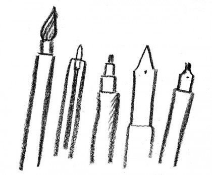
kcdpens

Pen & Ink

Pens produce clean lines, but they are often not erasable, so you have commit to the lines you create, and may take longer (more confidence) to master. You’ll also need to employ different shading techniques because they don’t blend as easily. They’re preferred for technical and architectural drawings too.

1. Ballpoint pens are cheap and very common, and work well on napkins.

2. Fineliner/fiber-tip and markers are better quality and come in several sizes (eg. fine, medium, broad), giving you thin or thicker lines. These are ideal for stippling (shading with repeated small dots) or cross-hatching (shading by drawing a series or parallel or crossing lines).

3. Ink can be used with brushes, bamboo, straws, sticks, and other drawing tools, giving you a variety of results, so definitely experiment with them. More care is necessary with ink as you can spill it, or stain yourself or clothing.
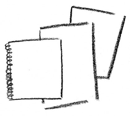
KCDpaper2

Paper

Drawing paper comes in varying weights and quality, and it’s nice to have a variety in your kit.

1. For quick, loose gesture drawing and sketching, I use newsprint, which comes in different-sized pads. It’s cheaper, and not archival quality, and comes in a smooth or rough texture. Either is fine, but the pencil glides more easily on the smoother grade.

2. Sketchbooks are usually medium weight and quality, are fairly inexpensive, and are great for everyday drawing.

3. If you want to use ink, watercolor, Conté crayons or pastels, consider buying the better quality paper that is usually textured and made for that purpose. They may be pricier, but they’re archival, and you’ll likely create something that is worth saving.
KCDeraserssm

Erasers

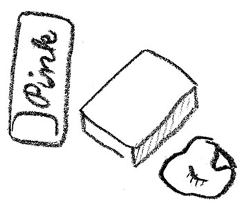
When you’re ready to upgrade from the one conveniently located at the end of your No. 2 pencil, here’s a few to try:

1. Kneaded or putty erasers—malleable as their name implies—are great because you can shape them to a fine point if necessary to rub out a detail, or fold them into themselves in order to find a “clean” side. You can even use them to blend, soften lines, and shading. I highly recommend having one (or more) of these in your kit.

2. Iconic “Pink Pearl” erasers, commonly found in stationery stores and schools, have been around for decades. They are usually found on the tip of yellow pencils, and will leave residue.

3. White vinyl erasers (eg. Staedtler Mars plastic) can be used to erase technical pens, but are now commonly found everywhere. I find that they often smudge the graphite a bit before erasing clean, but leave less residue.
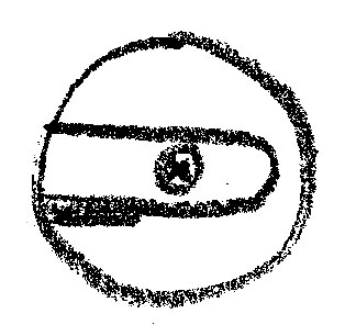
kcdsharpener

Sharpener

kcdclipboard

Clipboard

Consider purchasing a clipboard or easel. They’re portable desks and help position your drawing paper at an angle—more preferable to a flat desk position.

kcdchinamarker

A note about my favorite drawing implement: a Sharpie China Marker. Not really a marker, but a grease pencil. They are typically used to write on film, or marking negatives, and feel very similar to drawing with a wax crayon. I started using one when I created spot illustrations for a book I was designing, and now use them for all the drawings you see on Kid Can Doodle. They are self-sharpening, soft, and rich in color. I like the roughness of the line, which is more forgiving than a marker. You can see more of my China Marker doodles here.
 

Follow my blog with Bloglovin