Awesome Artists : Fred Blunt

awesome artists

In this series, Awesome Artists, we talk to our favorite artists to find out their techniques, learn how they draw, and get their tips for creating. Last time, we spoke to two artists who gave us a peek at their recent book projects: Richard Jones, illustrator of The Snow Lion, and Colleen Kong, illustrator of The Turtle Ship. Today, we’d like to introduce you to author AND Awesome Artist Fred Blunt.

Meet Awesome Artist Fred Blunt

Fred Blunt is an award-winning illustrator of a bunch of picture books — they all have his signature scribbley style, as you shall soon see (SORRY, I’m a fan of alliteration). Fred is kind enough to share some behind-the-scenes sketches from his latest book, Lionel the Lonely Monster

Lionel the Lonely Lion cover


Kidcandoodle: Hi Fred! Can you please tell us about your new book, Lionel the Lonely Monster

Fred Blunt: Lionel the Lonely Lion is a light-hearted story of friendship, kindness and the power of a hug.

KCD: What inspired the character?

FB: I’ve always loved monsters… right back to watching the muppets when I was little. I always loved the big scary-looking one “Sweetums” (from the Muppets, shown below), and I can still remember my mum reading me Where The Wild Things Are by Maurice Sendak when I was very small. 

sweetums


And Not Now, Bernard by David McKee is perhaps my favorite picture books of all time. So perhaps monsters have always been lurking, waiting to get out into a book for me?

Lionel monster inspiration


The story was actually inspired by a comic I wrote around 2012, called Rupert The Frog: A heart-warming tale of a frog who hates his un-froggy name, comforted by a bug cuddly bear who turns out to be called Kermit. I couldn’t work out how to make that into a picture book text, with the pop culture references, so I decided to write a story that had a similar heart, but more accessible.

Rupert the Frog


KCD: Can you show us more sketches from the story? We sometimes like to see what ideas don’t work, as well as ones that make it into the book.

FB: I think perhaps this is the very first drawing of Lionel in my sketchbook. The monster is sitting, looking sad, with a concerned little dog looking on.

first sketch for Lionel


These are my first scene drawings in my sketchbook… I tend to come up with little scenes, sketched very quickly – just trying to get something onto the page, to see if anything is working or worth exploring.

lionel sketch


lionel sketch


Many of these little scenes made it into the book, although the rowing boat didn’t.

lionel scene


lionel scene


Here’s a scene that was in my first draft manuscript, but sadly didn’t make it into the book.

lionel cut scene


It’s always painful to lose a nice visual gag or a nice line, but with only 32 pages, some good things have to go!

KCD: How did you choose the colors for the book? (I don’t think I’ve ever seen a PINK monster before – does that mean he’s girly?)

FB: The color palette came directly from my first color drawing of the cast of characters: Lionel with Lucy on his shoulders, walking Milo.

Lionel and Lucy, walking Milo


I liked the combination of colors and relished the chance to create a world in this limited palette. I tried a few sample illustrations and (the publisher) Oxford University Press was brave enough to let me tackle the whole book like it.

lionel title page


Lionel doesn’t mind if you consider him girly for being pink… he’s very at ease with his monsterhood! To be honest, I’ve never seen colors as either being for girls or boys… perhaps that’s because I grew up in the ’80s and it was the law for boys to wear pink Lacoste polo shirts, coupled with lemon yellow cardigans!

lionel scene


KCD: I love that your first sketch ended up being very close to the final cover art. It shows that sometimes…

“In drawing, nothing is better than the first attempt” – Pablo Picasso

FB: Picasso is my absolute art hero… the confidence of his work is what makes him so mind-blowing for me! It’s lovely when a cover comes so easily from your first thumbnail… it’s happened twice to me now – this and my book Gnome. I think when it comes to covers for picture books, the simpler and bolder the better; I find that my best work is the work that flows easily and naturally. The challenge is retaining the energy of a thumbnail into the final art.

***

Thanks for sharing your process with us, Fred. Please check out Lionel, the Lonely Monster by Fred Blunt, available here.

lionel hug


***

smileEvery professional illustrator sketches ideas before doing a final piece of art. The first sketches are very loose. Fred says, “I never worry about good drawings at this stage, I just want to get ideas onto the page.”
trythis

Next time when you want to create something, try sketching out a few ideas first. See how many ways you can approach the drawing, trying it in different way each time. Good luck!

***

All images copyright© Fred Blunt and used with permission.
Follow my blog with Bloglovin

Awesome Artist : Colleen Kong

awesome

In this series, Awesome Artists, we talk to our favorite artists to get insight on how they draw, and get their tips for creating. We spoke to  Allison Langton, who shared her watercolor techniques with painting plants, and Tim Miller, who gave us a peek into his process for creating the picture book, Snappsy the Alligator. Today we welcome back one of our friends, Colleen Kong-Savage, who was our very first guest for 3 & 1/2 Questions.
 

Meet Awesome Artist Colleen Kong

 
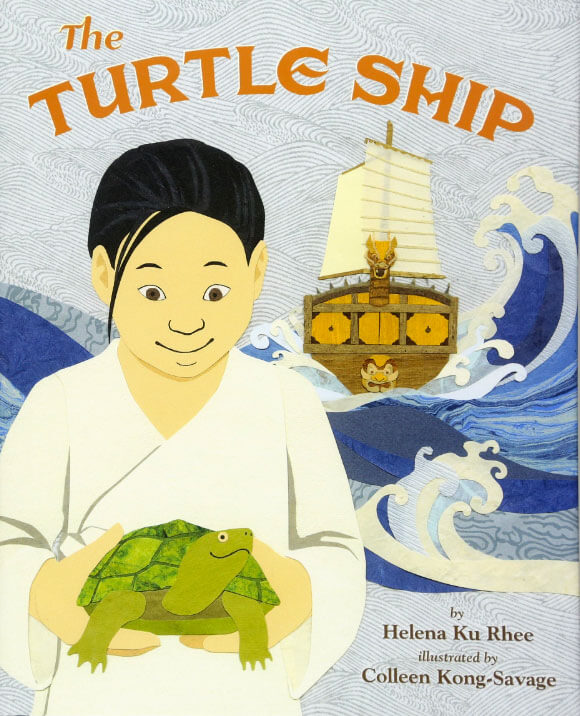
TurtleShip_cover

I’m so excited for Colleen as this is her debut as a picture book illustrator. Above is the cover of The Turtle Ship by Helena Ku Rhee, illustrated by Colleen Kong-Savage. Colleen uses a technique called collage – doodling with paper. We’re so excited to share Colleen’s process in drawing with scissors and paper.

The Turtle Ship is a story about a poor boy named Sun-sin who dreams of traveling the world. One day a contest is announced that the winner of best ship design would get to sail with the royal navy. Sun-sin’s idea for a ship is inspired by his best friend, a turtle called Gobugi (which means “turtle” in Korean).

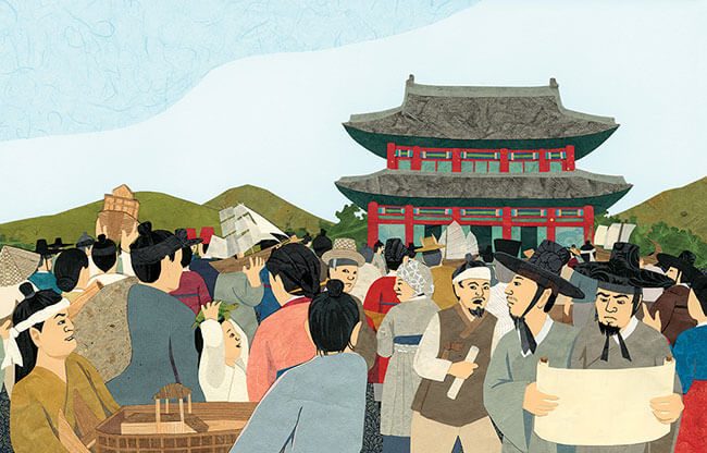
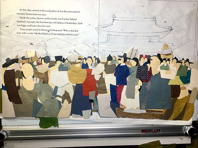
Colleen is going to share with us one of the most difficult scenes she worked on for the book, as seen below.

KCD: Hi Colleen. Thanks for stopping by and sharing your work with us! Can you tell us a little bit about this scene from the book?

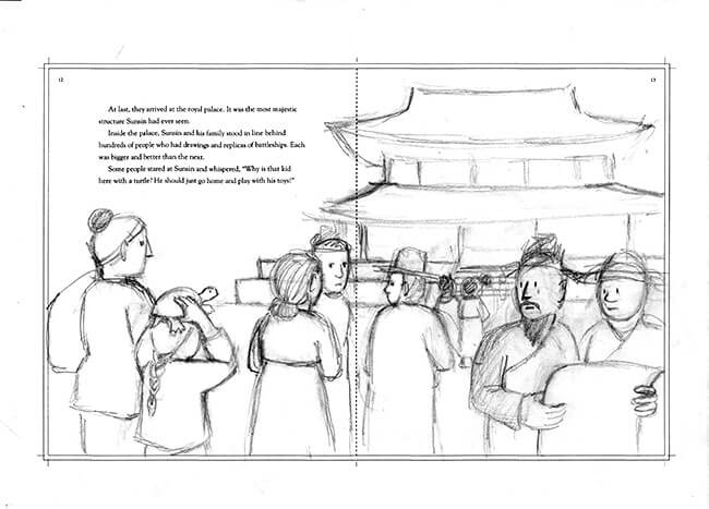
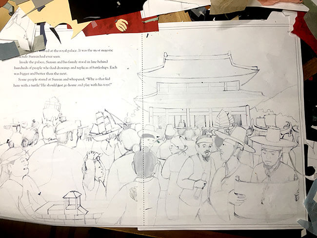
CKS: For this scene, I wanted show the Gyeongbokgung Palace, which was the grandest of all the palaces built in the Joseon Dynasty, the period in which Sunsin lived. So I did a sketch to show the art director how I planned to illustrate this scene. It was rough, messy, and fast because the purpose of the sketch was to show the Art Director my idea.

The Art Director said, “We like the expressions of people wondering why a kid is there with a turtle. It’s cute the way you have him holding the turtle on his head. We suggest backing out in space so we can see many more of the “hundreds of people.” Right now it looks like there are only six other people.”

Arrival_sketch 1

smileNote that Colleen shows a sketch before starting a final drawing. The above is the first one she showed, and she does a few more before it gets approved to proceed to final draft.

trythisBefore doing a drawing, see how many ways you can sketch the drawing. Trying different viewpoints or changing something about the subject or try different ideas.

KCD: How did you react to the Art Director’s feedback?

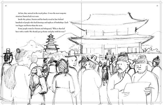
CKS: I don’t know if you ever noticed — drawing people is not easy, not even for a professional artist. But the Art Director was right, I hadn’t drawn very many people, so I sketched some more.

“How’s this?” I asked the Art Director.

She said, “This is a little better with a few more people added, but we still don’t get a sense of hundreds, and nobody has a replica of a battleship.”

Arrival_2

Argh! Drawing a crowd is a lot of work! You have to make up many different faces, and many different bodies doing different activities, wearing different clothes, in different positions from the viewer’s point of view. Plus as a collage artist I was imagining all the like tiny bits of paper I’d be cutting out in the final illustration. And oh yeah, I had forgotten about the replicas.

“How about this?” I asked the Art Director. “Is this enough people and battleships? And do you like how you can see Sun-sin’s face now? I want people to see that he’s excited to be here.”

Thankfully, the Art Director said, “YES!”

Arrival_3

KCD: How do you start drawing with paper?

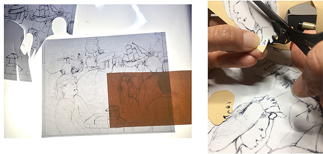
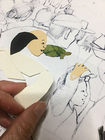
CKS: I make many copies of this drawing. I use most of them to help me cut out all the individual shapes from the papers I want to use. With the help of a light table I trace facial expressions. And I always keep one copy of the master drawing whole. 

This copy is my template and it helps me figure out where to put the pieces.

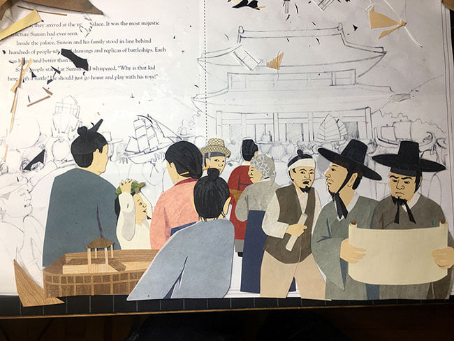
As I put the pieces in place I glue them to each other—not onto the template. I will glue the crowd to another background when it’s complete.

This is what the back of a whole crowd of people look like.

Arrival_8

***

Phew! I bet it took a long time to complete pasting all the people and their details. Here is the completed scene again. Thanks for sharing your process with us, Colleen!


smileEvery professional illustrator sketches ideas first before doing a final piece of art. The final art takes a long time, so it’s important to work out all the details first, and that way, you’ll make all your mistakes in the early draft and not the final art.

trythis

Next time when you want to create something, try sketching out a few ideas first. See how many ways you can approach the drawing, trying it in different way each time. Good luck!

***

Colleen Kong-Savage is an illustrator, artist, and graphic designer. Her picture book debut, The Turtle Ship is published by Shen’s Books, a multicultural children’s book publisher based in California. Shen’s Books aims to emphasize “cultural diversity and tolerance, with a focus on introducing children to the cultures of Asia.”

All images courtesy of Colleen Kong-Savage.


Follow my blog with Bloglovin


Awesome Artists : Richard Jones

awesome

In this series, Awesome Artists, we talk to our favorite artists to find out their techniques, learn how they do things, and get their tips for creating. We spoke to Kirsten Ulve to get pointers on sketching people, and Allison Langton, who shared her process on painting plants in watercolor. Today we get a peek into the mind of Richard Jones, via his sketchbook for The Snow Lion (a collaboration with Jim Helmore for Simon & Schuster Children’s Books). Richard shows us how he created the characters for this special book.

Meet Awesome Artist Richard Jones


Snow Lion cover

I confess — I’ve been admiring Richard Jones’ work for awhile now. What he does with paint and color is pure magic. I’m so jazzed we get to share his work with you! I think you’ll adore it too.

KCD: Hi Richard. Thanks for being one of our Awesome Artists! Can you share with us how the character of Caro came to life? Were there influences in her formation?

RJ: I began sketching ideas out in my sketchbooks first. My first character sketches of Caro were quite different from how she eventually appears. Most of my original character sketches had her being a little older and rendered a bit more realistically. I think it was Jane, my art director at Simon & Schuster who suggested that Caro might loosen up a little and I’m so glad she did!
Richard Jones' Cora

Richard Jones' Cora Richard Jones' Cora

Once I found her character, things fell into place and she was a joy to draw. In terms of her appearance, Caro is a combination of the two girls that help me at the very beginning when I needed someone to pose for me! (I dedicated the book to them!) Richard Jones' Cora

Her clothes did take a little time to get right. I liked the idea that even inside her new home she was often buttoned up in a large and warm, protective coat. When she’s having the most fun with the lion her clothes are a little more colourful and jolly!

smileNote how Richard plays around with the character’s age and hair. The clothes and big hair make her younger.

RJ: Caro’s friend Bobby and his dog evolved from my sketchbooks in a similar way…

Richard Jones Richard Jones

trythisDraw a girl or boy and try different hairstyles and clothes on them. See how you can change their age or personality by changing what they wear.

KCD: What was most challenging about creating the title character The Snow Lion?

RJ: The Snow Lion took many, many pages of sketchbook scribbling before I was satisfied I had found his character. It was clear early on, however, that his and Caro’s relative sizes would be important to how we understood their relationship — too big and he seemed overbearing, while when he was much smaller he seemed to lack the qualities of comfort and support he needed to offer her.
Richard Jones

KCD: The lion is so plush and comforting; I think that adds to the sweetness and feeling of the story. There’s something about how you convey that connection — I can see a child wanting that protection and bond too. Did you have inspiration for that?

RJ: Again, it was Jane that had a big influence here. She kept saying ‘softer, softer, softer!’. Surprisingly that wasn’t as off-putting as it sounds…. As we were beginning work on The Snow Lion I was finishing off another story in which I’d painted a snow shoe hare against a blue background. It’s my favourite page in that book and his white, fluffy fur definitely influenced how I began to create Caro’s lion.

I was conscious that there was a potential for the whiteness of his coat to seem cold and perhaps a little sterile, especially against some of the white walls in the early spreads, so I took my time warming him up a little with lots of water colour washes and gentle textures. Jim [Helmore]’s choice of a lion for her companion is just the perfect. He’s the ideal animal for the role — Caro can hide behind his huge body when she’s feeling unsure, or sink into the comfort of his soft mane when she wants a cuddle!

Although his scale may shift fractionally through the spreads to suit the circumstances, his warm fur and soft mane is always available when she needs him!

Richard Jones

A very early character sample. The painterly quality of his fur made it into the final book though his bushy mane grew in stature!

Richard Jones

It was a real honor to work with such a beautiful and sensitive tale. It’s a story that I hope will resonate with all little ones who are struggling with change of one kind or another. The Snow Lion reassures both Caro and the reader alike that loneliness and sadness are natural but never last forever.

smileSee how Richard makes the character Caro feel safe and secure with The Snow Lion, rather than frightened or scared?

The Snow Lion by Jim Helmore and Richard Jones, published September 2017 by Simon & Schuster Children’s Books.

***

Richard Jones is an illustrator based in Devon, England. He also illustrated Town Mouse, County Mouse and Feelings for Little Tiger Press.

trythisTry sketching a character from one of your favorite stories. Consider how you could change him or her by changing the way they look. For instance, what if Goldilocks didn’t have blonde hair. Or what if Pippi Longstocking was a boy instead? Consider how changing their hair or clothes can really change the story or how we feel about the character.

All images are courtesy of Richard Jones and copyright of the artist.


Follow my blog with Bloglovin


Awesome Artists : Tim Miller

awesome

In this series, Awesome Artists, we talk to our favorite artists to find out their techniques, learn how they do things, and get their tips for creating. We spoke to Kirsten Ulve to get pointers on sketching people, and Allison Langton, who shared her process on painting plants in watercolor. Today we get a behind-the-scenes look at creating a picture book as we chat to Tim Miller, who brought Snappsy the Alligator (words by Julie Falatko) to life (even though he didn’t ask to be!)

Meet Awesome Artist Tim Miller

Snappsy-Covers

Above (from left to right) are Tim Miller’s sketch, color study, and final cover art with typesetting.

It’s such a treat to see these process images, because we usually only see the final art and it’s so easy to focus on how ‘perfect’ they are. It’s important to know that there are many steps to get to the final art. Nearly all professional artists begin with sketches, the rough ideas that we all make — the ‘doodles.’ I want to demystify the process of making beautiful pictures, but I also want to show how much time and love actually goes into creating these wonderful illustrated books.

KCD: Hi Tim. Thanks for stopping by and sharing your work with us! Can you tell us how do ideas come to you?

TM: The inspiration for my work simply comes from a very mundane knee-jerk response to some sort of external stimulus in the world that strikes a chord with me. (For example, the first time I encountered Julie Falatko’s Snappsy the Alligator, mental images came to mind as I read the story — and those mental pictures became the foundation to build upon.) When I begin to sketch an idea, I try to draw what I’m seeing in my mind as best I can, but it’s not always clear. Usually, it becomes clearer only after I make several rough sketches. I continue to refine the concept until I land on something that feels solid.

I think of the process as trying to make out something in the fog. It’s difficult when you’re far away, but as you draw nearer, the details become more distinguishable. A key part of the process, though, is that I have to be entertained. There has to be a good personal motivation in it to lure me forward.

Tim Miller shows How To Doodle Snappsy in this video:

Snappsy Did Not Ask to Be in This Video About How to Draw Him from Tim Miller on Vimeo.


smileNote that Tim sketches with a brush. There’s a loose, fluid quality to the doodle that the ink and brush gives, with variation in the line width and opacity.

trythisHow many shapes does he use? Try drawing Snappsy as Tim demonstrates with a brush, then create your own character with only one or two shapes, such as ovals/circles or squares/rectangles.

KCD: Can you show us your process for creating the art for the book?

TM: One of my favorite scenes to draw in Julie Falatko‘s Snappsy the Alligator (Did Not Ask to Be in This Book) is when Snappsy throws a party. I drew my first sketch directly on the manuscript to make note of the first idea that came to mind when I read it.

party text

Next, I used that rough thumbnail as a starting point to fill out the scene a little more, giving a better sense of space & atmosphere.

party sketch

Then, I began to tighten up the drawing to see things more clearly making some edits here and there to tweak the overall composition.

Party1

I went back at it again with minor adjustments after sharing my roughs with my Art Director Denise Cronin and Editor Joanna Cardenas. The donkey by the door was reading too much like Snappsy (which I knew they were going to say but I really like drawing him), so they asked me to turn it into a different character which is how the weird dog poodle thing came to be. I was also still working out the final look for Snappsy so you can see him changing here too.

party sketch revise

Then it came time to figure out the colors, so I did a rough color sketch. It took me awhile to figure out what color would be good for the interior of Snappsy’s house. I needed something that complimented his green without overpowering him.  From there, I tried to settle on a festive palette of party hats, balloons, and streamers that popped but also balanced with rest.

Party2

For the finish, first I redrew everything in separate peieces with brush and ink and added watercolor to the drawings. Then, I scanned everything in and pieced it together on the computer adjusting all the colors digitally.

party background

part color with furniture

party color

And finally two minutes before everything needed to go to the printer, things landed here:

Party3

smileSee how important it is to work out details in your drawing in a loose sketch first? There’s quite a few drafts before getting to the final art.

Below watch the book trailer that Snappsy did NOT ask to be in:

“Nope,” says Snappsy.

Snappsy the Alligator (Did Not Ask to Be in This Book) words by Julie Falatko, pictures by Tim Miller, published by Penguin Random House.

***

Tim Miller is an author and illustrator based in New York City. His own Moo Moo in a Tutu, published by Balzer & Bray debuts in early 2017.

trythisCompose your next work of art by planning it out first. Sketch a few different ideas, or perspectives/viewpoints of the subject. Before adding color, consider your palette, play with different combinations, and decide your final medium: colored pencils, watercolors or perhaps acrylic paint. You may not do this with every drawing, but when you’re working on something you want to keep, the early prep will help make the final color work much more enjoyable.

All images courtesy of Tim Miller.


Follow my blog with Bloglovin


Awesome Artists: Allison Langton

awesome

In this series, Awesome Artists, we talk to our favorite artists to find out their techniques, learn how they do things, and get their tips for creating. We spoke to Kirsten Ulve, when we were drawing selfies, to get pointers on sketching people. Now that we’re focusing on nature, I’ve asked Allison Langton, an illustrator who’s a master with watercolor and drawing plants and flowers, to share her tricks for mixing colors and working with this wet medium.

I had the pleasure of working with Allison when we worked on the design/illustration of a gardening book called Grow a Little Fruit Tree by Ann Ralph for Storey Publishing. She is as nice as she is talented — thanks for sharing your work with us Allison!

Meet Awesome Artist Allison Langton

05-photoshop-bearded-iris-allison-langton

Above is a bearded iris illustration that Allison did for Australian House & Garden magazine. Below she gives us a peek into her process.

KCD: Watercolor is a medium that is easy to learn, yet hard to master. It’s quick drying, yet takes time to fine-tune the painting. What makes watercolor ideal for illustrating nature?

AL: I think the translucency and blending qualities of watercolor make it the perfect medium for illustrating nature. The ability to build up color over multiple layers or bleed colors together to create new and unexpected combinations is ideal for capturing the constantly moving, changing and growing characteristics of nature.

01-drawing-finding-the-line

smileAs you can see here, Allison is sketching irises and exploring ways to capture this flower. It’s important to sketch and work out things such as how many flowers to show, angles, perspective, composition, before going to a final drawing. It’s good to realize that not every drawing is a “masterpiece,” and that sometimes it’s ok to try it several times.

KCD: I find that when I draw nature, I get overwhelmed by the details. For instance, a tree is made up of many leaves, and I find myself defining each one. How do you figure out what details to leave out and what is necessary to give your work realism?

AL: I struggle with this! It’s such a big challenge for artists but I think it becomes easier with practice.

The great thing about watercolor is that you start painting light to dark, so you can lay down a light wash or suggestion of trees and branches then go back in with some leaf detail but only where you want the eye to focus — much like in landscape painting where the foreground is usually much more detailed than the background to draw the viewers eye into the landscape.

02-pencil-drawing

smileSee how Allison starts the drawing with a light pencil sketch that she uses as a guide for her painting?

KCD: The other thing I find hard to do is mixing the colors, so I don’t end up with one big green blob for trees, leaves, and grass. Or blending a blue color for sky that doesn’t seem like you just squeezed it out of the tube. Do you have a trick for this? How do you vary the palette to keep it true, and interesting?

AL: Mixing colors takes time to master. I’m still learning. Nature is full of different greens. Yellow greens, blue greens, dark olive greens, silvery grey greens. You can create a whole palette of greens by mixing your tube green with a little yellow to get a lime green or a little blue for a teal green or even with some red for a darker olive green.

A good mixing tip so colors don’t look like they’ve come straight from the tube is to ‘dirty them’ by adding a little bit of color from the opposite side of the color wheel. For greens, this means adding a little red. Just a little. I will add a little crimson to some hookers green or sap green to create more of a realistic olive green when I’m painting leaves. For blue, this means adding just a touch of orange, for yellows add a touch of violet.

trythisOften when trying to make colors darker, we add black to it, but have you noticed that this also makes the color “dead,” or less vibrant? Try adding a complementary color instead (the color opposite on the color wheel), a technique that Allison refers to above as making it “dirty.”

Sometimes your painting will be more harmonious if you limit your color palette. A great example of this would be the artist Anders Zorn (1860-1920) a Swedish painter, who was famous for using only ochre (yellow), vermilion (red), white and black in his paintings. He used oil paints but the color theory is still the same. This video is a great example of just how many colors you can get by mixing two colors plus white and black.


“Amazing!”


Always practice mixing your own colors, it’s such a handy skill. And you won’t have to buy as many tubes!

03-watercolour-leaves-stems-first-wash

smileAllison has her reference photos close by as she’s working on her final draft of the drawing.

KCD: What do you find most challenging about drawing nature?

AL: Capturing the spontaneity of nature is tough. I tend to be very tight and controlled when painting which can often lead to an overworked lifeless illustration. I have to remember to loosen up a bit, work more on blending colors on the paper rather than my palette. It’s a constant work in progress…

04-watercolour-flower-washes

***

Allison works under the name Big Print Little in Melbourne, Australia. Thanks for sharing your work with us Allison!

trythisHave you tried watercolors or watercolor pencils? They’re fun to experiment with. You can add color to drawings very quickly by doing big washes of color; the water flows and is not easily controlled, but it gives a lovely variation to the color. With the pencils, you can draw first and then add water to change the drawing into a painting, making it a bit less mess.
What do you like about watercolors?


All images courtesy of Allison Langton.


Follow my blog with Bloglovin

Awesome Artists: Kirsten Ulve

awesome
Today we’re debuting a new feature called Awesome Artists. In this column, we aim to examine artists’ works and see if we can learn from their techniques, process, or expertise.

Meet Awesome Artist Kirsten Ulve


kirstenulve1

It’s such a pleasure to start this terrific series with someone whose work I’ve always admired: Kirsten Ulve. A renowned illustrator who specializes in creating caricatures, Kirsten works in a digital medium using Adobe Illustrator and Photoshop. Her stylized work has appeared in countless publications including The New Yorker, Glamour, Entertainment Weekly, and InStyle.

kirstenulve2

I marvel at her ability to capture the essence of someone in her unique voice — and she was gracious to grant us an interview! Kirsten not only shares her creative process, but her pencil sketches (which she would propose to a client before doing a final colored rendition) too.

smile
See if you can guess who is depicted in the drawings!

oprah sketch

KCD: Do you try a few different sketches, trying to see how much you can stylize someone?

KU: No, I  just start sketching and see where it goes. For me, there is usually only one answer when doing caricature: it either looks like the person, or it doesn’t! Sometimes I simplify the drawing when it goes to color.

thoughtHer stylized approach reminds me of Cubism. The way the physical features seem to “sit” on different planes, as if there are multiple viewpoints instead of one perspective is common in Cubist paintings. The sharp angles with contrasting curvy swirls mimic the fragmented look seen in works by “Les Demoiselles D’Avignon” (1907) by Pablo Picasso or “Woman with a Mandolin” (1910) by Georges Braque.

Oprah


What do you look for when you draw someone?

I always start with the eyes and try to capture the feeling there, or the personality the person usually shows to the public (or portrays in a movie if the caricature is about that). It helps to look at video of the person speaking so I can see how their mouth moves, or how much their teeth show when they’re speaking, or how far their nose sticks out. A lot of pictures are taken head on, so it’s hard to see how big noses are. Then I look at the distances between features on the face.

question
There’s a geometric quality to her characters. Can you see circular or triangular shapes or parallelograms in her drawings?

Amy Poehler sketch Amy Poehler

Who/what types of faces(?) was/are the hardest person to draw? And why?

I can never predict who’s going to be hard or easy to draw. It just depends on what mood I’m in. I can’t do it if I’m tired or angry. It’s like I just start drawing and they just eventually appear. But in the past, the people that took me forever to get right were Sara Jessica Parker and Bradley Cooper! I think the reason is because I was focusing too much on one feature instead of capturing the whole face, which I always try to do.

Shaqsketch
Shaq

smile
Don’t you love that she’s audacious enough to color someone purple?

For most people, drawing a face is the most difficult; it’s hard to capture the likeness well. It seems amazing to me that you so confidently capture their likeness, while infusing your own voice. Is there any insight you can impart to all of us who are learning to do that?

For me, it makes it so much easier to draw someone if you’re familiar with the way they act (this is why I like to use video). Also, it really helps if you can try to “be” that person a little bit while you’re drawing. Go ahead and try to imitate them! It helps me get their expressions right. I try not to work from one photo. It’s good to have a variety of pics at different angles with different expressions. This way you can get a feeling of how someone moves their face. It’s hard to work from normal, smiling photos. A person’s unique look comes out more when you can see them being themselves.

***

It’s interesting to learn that Kirsten prefers to use videos for drawing reference instead of photographs. Whenever possible, it’s better to draw things that we can see three-dimensionally, rather than a 2D image. I think it often feels more lively when we do. Sometimes a photograph can distort information we see, depending on light and perspective, and be misleading when we try to copy it. (Not a perfect example, but remember that viral blue and gold dress?)

trythis

Let’s conduct an experiment! Ask a sibling or friend to let you draw them for 10 minutes. Then take a photo of them in a similar pose, and use that image as reference to draw them. Do you notice a difference? Is there an improvement in your drawing or does one portrait feel more authentic than the other?

Thanks again for sharing your work with us Kirsten! See more of her fabulous work here or purchase her art here.

All images courtesy of Kirsten Ulve.


Follow my blog with Bloglovin