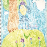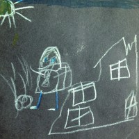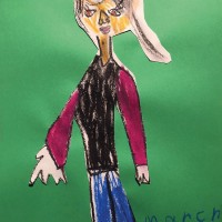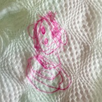
Picasso Portraits doodle download

Picasso Portraits doodle download


kcd doodling : Picasso Portraits


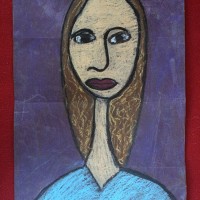
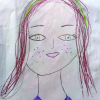
Have you seen Picasso’s work, especially his Cubist portraits? This doodle download, kcd doodling : Picasso Portraits, was inspired by many of Picasso’s portraits from Picasso 1932 : The Year of Wonders, the artist’s retrospective at the Tate Modern, London (through Sept 9, 2018). The year refers to the date in which the artist had his first major retrospective at the Galeries Georges Petit in Paris at the age of 50, with an impressive 225 paintings, seven sculptures, and six illustrated books.

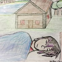
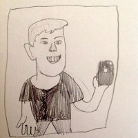
Using some of the themes taken from Cubism, such as dis-proportions and dis-placed features, we challenge artists to doodle portraits. Doodlers will learn about the influential style made famous by Picasso and George Braque while creating (likely) silly pictures.

Click here to download the zine Picasso Portraits. Or click on the image below for a color-in doodle download.

Please note that by downloading kcd doodling : Picasso Portraits, you agree to these terms.

This doodle download was previously created for our doodle club on Patreon, but made available for a limited time due to the Covid-19 worldwide quarantine. We’d love to see your Picasso Portraits too. Tag us #kidcandoodle when you share online. See our other doodle downloads in Fun&Games.

Happy doodling!


Follow my blog with Bloglovin

Selfies

selfies_2

Our first show featuring portraiture is one of my favorites. We looked at self-portraits from the masters, and had some great guests (Justin Garnsworthy, Charlotte Love, Bill Sullivan, Kirsten Ulve) who showed us how they do faces. I hope you found How to Draw Your Face and 5 Ways to Draw a Selfie helpful, and enjoyed seeing the Museum of Selfies.

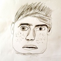
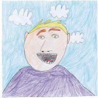
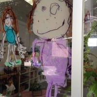
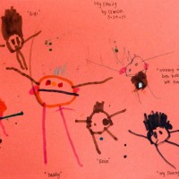
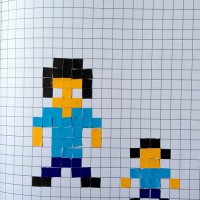
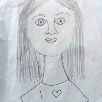
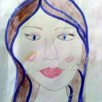
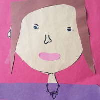
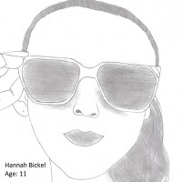
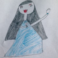
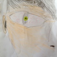
I love seeing everyone’s take on themselves, and just wanted to give a shout out to a couple of entries that featured different media or techniques: Colette’s use of collage, Dylan’s “Minecraft” pixel portrait, and Elena’s window drawing. I also adored Cameron’s expression, and seeing Henry’s haunting(?) eyes. Thanks to all who took the time to enter! We [heart] you!


Follow my blog with Bloglovin

Awesome Artists: Kirsten Ulve

awesome
Today we’re debuting a new feature called Awesome Artists. In this column, we aim to examine artists’ works and see if we can learn from their techniques, process, or expertise.

Meet Awesome Artist Kirsten Ulve


kirstenulve1

It’s such a pleasure to start this terrific series with someone whose work I’ve always admired: Kirsten Ulve. A renowned illustrator who specializes in creating caricatures, Kirsten works in a digital medium using Adobe Illustrator and Photoshop. Her stylized work has appeared in countless publications including The New Yorker, Glamour, Entertainment Weekly, and InStyle.

kirstenulve2

I marvel at her ability to capture the essence of someone in her unique voice — and she was gracious to grant us an interview! Kirsten not only shares her creative process, but her pencil sketches (which she would propose to a client before doing a final colored rendition) too.

smile
See if you can guess who is depicted in the drawings!

oprah sketch

KCD: Do you try a few different sketches, trying to see how much you can stylize someone?

KU: No, I  just start sketching and see where it goes. For me, there is usually only one answer when doing caricature: it either looks like the person, or it doesn’t! Sometimes I simplify the drawing when it goes to color.

thoughtHer stylized approach reminds me of Cubism. The way the physical features seem to “sit” on different planes, as if there are multiple viewpoints instead of one perspective is common in Cubist paintings. The sharp angles with contrasting curvy swirls mimic the fragmented look seen in works by “Les Demoiselles D’Avignon” (1907) by Pablo Picasso or “Woman with a Mandolin” (1910) by Georges Braque.

Oprah


What do you look for when you draw someone?

I always start with the eyes and try to capture the feeling there, or the personality the person usually shows to the public (or portrays in a movie if the caricature is about that). It helps to look at video of the person speaking so I can see how their mouth moves, or how much their teeth show when they’re speaking, or how far their nose sticks out. A lot of pictures are taken head on, so it’s hard to see how big noses are. Then I look at the distances between features on the face.

question
There’s a geometric quality to her characters. Can you see circular or triangular shapes or parallelograms in her drawings?

Amy Poehler sketch Amy Poehler

Who/what types of faces(?) was/are the hardest person to draw? And why?

I can never predict who’s going to be hard or easy to draw. It just depends on what mood I’m in. I can’t do it if I’m tired or angry. It’s like I just start drawing and they just eventually appear. But in the past, the people that took me forever to get right were Sara Jessica Parker and Bradley Cooper! I think the reason is because I was focusing too much on one feature instead of capturing the whole face, which I always try to do.

Shaqsketch
Shaq

smile
Don’t you love that she’s audacious enough to color someone purple?

For most people, drawing a face is the most difficult; it’s hard to capture the likeness well. It seems amazing to me that you so confidently capture their likeness, while infusing your own voice. Is there any insight you can impart to all of us who are learning to do that?

For me, it makes it so much easier to draw someone if you’re familiar with the way they act (this is why I like to use video). Also, it really helps if you can try to “be” that person a little bit while you’re drawing. Go ahead and try to imitate them! It helps me get their expressions right. I try not to work from one photo. It’s good to have a variety of pics at different angles with different expressions. This way you can get a feeling of how someone moves their face. It’s hard to work from normal, smiling photos. A person’s unique look comes out more when you can see them being themselves.

***

It’s interesting to learn that Kirsten prefers to use videos for drawing reference instead of photographs. Whenever possible, it’s better to draw things that we can see three-dimensionally, rather than a 2D image. I think it often feels more lively when we do. Sometimes a photograph can distort information we see, depending on light and perspective, and be misleading when we try to copy it. (Not a perfect example, but remember that viral blue and gold dress?)

trythis

Let’s conduct an experiment! Ask a sibling or friend to let you draw them for 10 minutes. Then take a photo of them in a similar pose, and use that image as reference to draw them. Do you notice a difference? Is there an improvement in your drawing or does one portrait feel more authentic than the other?

Thanks again for sharing your work with us Kirsten! See more of her fabulous work here or purchase her art here.

All images courtesy of Kirsten Ulve.


Follow my blog with Bloglovin

Faces of Love

Screen-Shot-2015-03-17-at-6.40

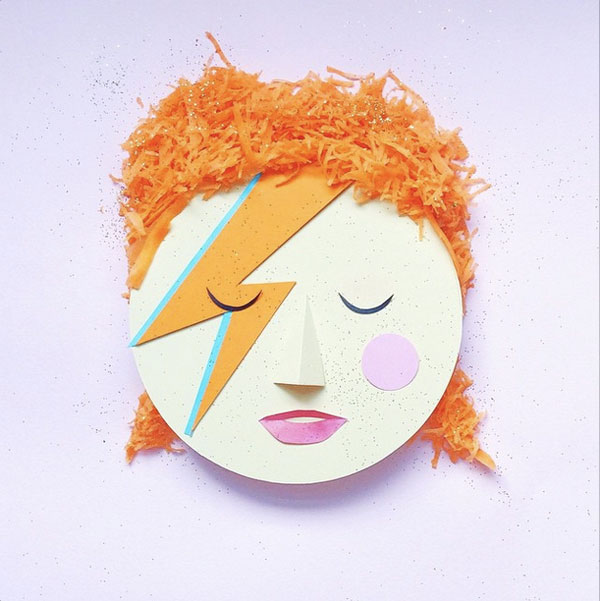
KCD is so smitten with Charlotte Love’s food-centric Instagram portraits. The London-based stylist creates clever images using paper, fresh ingredients and a lot of imagination. We first spied her work on event planner Jordan Ferney’s gorgeous blog, and were pleased that Charlotte agreed to let us share her work in our forthcoming mini-mag! We couldn’t wait to post a few images here too!

Screen-Shot-2015-03-17-at-6.42 Screenshot-2015-03-09-22.24Screen-Shot-2015-03-17-at-6.43 Screenshot-2015-03-09-22.15Screen-Shot-2015-03-17-at-7.04

Did you recognize a few familiar faces?

Images courtesy Charlotte Love, via Oh Happy Day.


Follow my blog with Bloglovin

3 & 1/2 Questions: Bill Sullivan

BSi-RtZwFNC-X2

The artist (above) with a very personal piece.


I want to introduce you to New York-based artist Bill Sullivan, an accomplished painter/photographer/publisher who, like Chuck Close, has also specialized in portraits in his career. Bill’s photo-realistic oil paintings are a contrast to Justin Garnsworthy’s loose molten-plastic portraits we featured last week. The work presented here were all from “People I Know,” shown at the Sasha Wolf Gallery in downtown NYC.

We’re so lucky that busy Bill had time to “sit down with us” for an interview!

i-rNz78W5-X2

Can you tell us a bit about your work process?

  1. After choosing a model, I photograph the person quite close in several different lighting situations. The way the light shapes the face is probably the single most important thing about the whole process and eventual outcome. You can take the same face in light of four different ways and sculpturally it will be an entirely different thing each time. After taking 200 or so photographs those are edited down to about 10 which I study for a while and eventually decide on a single one to really begin to fine-tune.
  2. The next step is building a very accurate mock-up of where the eventual portrait goes.
  3. Then I paint directly from a 17 inch laptop, projecting the image onto the canvas.
  4. I double-check the accuracy of the painting by photographing and overlaying it over the original image, repeating this five or six times.

And at the end of the process the two become the nearly the same.

BSi-H3P8wkG-X2

How long does it take to produce one of these masterpieces?

From beginning to end, it usually takes about a month including the photography and mock-up stage. The oil paint takes about 3 to 4 days to dry for each coat so the painting part takes about three weeks or so.

BSi-D5sQsFL-X2

How old were you when you did your first painting?

It’s funny—I’ve been doing this since I was about 16 or 17, so for over 30 years. It was a skill I knew I had quite early on: to create a likeness of someone that people found interesting or pleasing on some level.

BSi-6QzWsJR-X2

Please fill in the blank: I like to draw __.

People—obviously!

Bill’s work is proof that having good reference to work from can really make a difference in your final drawing. Good lighting provides highlights and shadows that help shape your drawings and make them more life-like. While his impressive technique can blow us away, KCD wants stress that this is only ONE style of working, and is not necessarily the goal for everyone to work this way. We encourage everyone to develop their own voice with practice (and to share them in our shows).

Thanks for sharing your work with us Bill! To see more of his amazing portraits or other projects, click here. Please tell us what you like most about Bill’s work below.

All images courtesy of Bill Sullivan.


Follow my blog with Bloglovin